library(tidyverse)
library(palmerpenguins)
if (!file.exists("data/galton.csv")) {
  download.file(url = "https://raw.githubusercontent.com/CU-F24-MDSSB-01-Concepts-Tools/Website/refs/heads/main/data/galton.csv",
                destfile = "data/galton.csv")
}
if (!file.exists("data/Viertelfest.csv")) {
  download.file(url = "https://raw.githubusercontent.com/CU-F24-MDSSB-01-Concepts-Tools/Website/refs/heads/main/data/Viertelfest.csv",
                destfile = "data/Viertelfest.csv")
}
galton <- read_csv("data/galton.csv")
viertel <- read_csv("data/Viertelfest.csv")W#05: Descriptive Statistics, Exploratory Data Analysis
Box-Cox transformation function
For \(p \in \mathbb{R}\): \(f(x) = \begin{cases}\frac{x^p - 1}{p} & \text{for $p\neq 0$} \\ \log(x) & \text{for $p= 0$}\end{cases}\)
The \(p\)-mean is
\[M_p(x) = f^{-1}(\frac{1}{n}\sum_{i=1}^n f(x_i))\]
with \(x = [x_1, \dots, x_n]\). \(f^{-1}\) is the inverse of \(f\).
- Inverse means \(f^-1(f(x)) = x =f(f^-1(x))\).
- Box-Cox is a common transformation in data pre-processing to make the variable’s (arithmetic) mean being a “good” measure of central tendency.
pfun <- function(x, p) (x^p-1)/p
ipfun <- function(x, p) (p*x + 1)^(1/p)
ggplot() +
    geom_function(fun = pfun, args = list(p = 1), color="red", size = 1.5) +
    geom_function(fun = pfun, args = list(p = 2), color = "red", alpha=0.6) +
    geom_function(fun = pfun, args = list(p = 3), color = "red", alpha=0.3) +
    geom_function(fun = pfun, args = list(p = 1/2), color = "red3") +
    geom_function(fun = pfun, args = list(p = 1/3), color = "red4") +
    geom_function(fun = pfun, args = list(p = -1), color = "blue", size = 1.5) +
    geom_function(fun = pfun, args = list(p = -1/2), color = "blue3") +
    geom_function(fun = pfun, args = list(p = -1/3), color = "blue4") +
    geom_function(fun = pfun, args = list(p = -2), color = "blue", alpha=0.6) +
    geom_function(fun = pfun, args = list(p = -3), color = "blue", alpha=0.3) +
    geom_function(fun = log, color = "black", size = 1.5) + coord_fixed() +
    xlim(c(0.01,4)) + ylim(c(-2,2)) +
    labs(x="x", y = "f(x)", title = "p = -1 (blue), 0 (black), +1 (red)") +
    theme(title = element_text(size = 2)) +
theme_minimal() 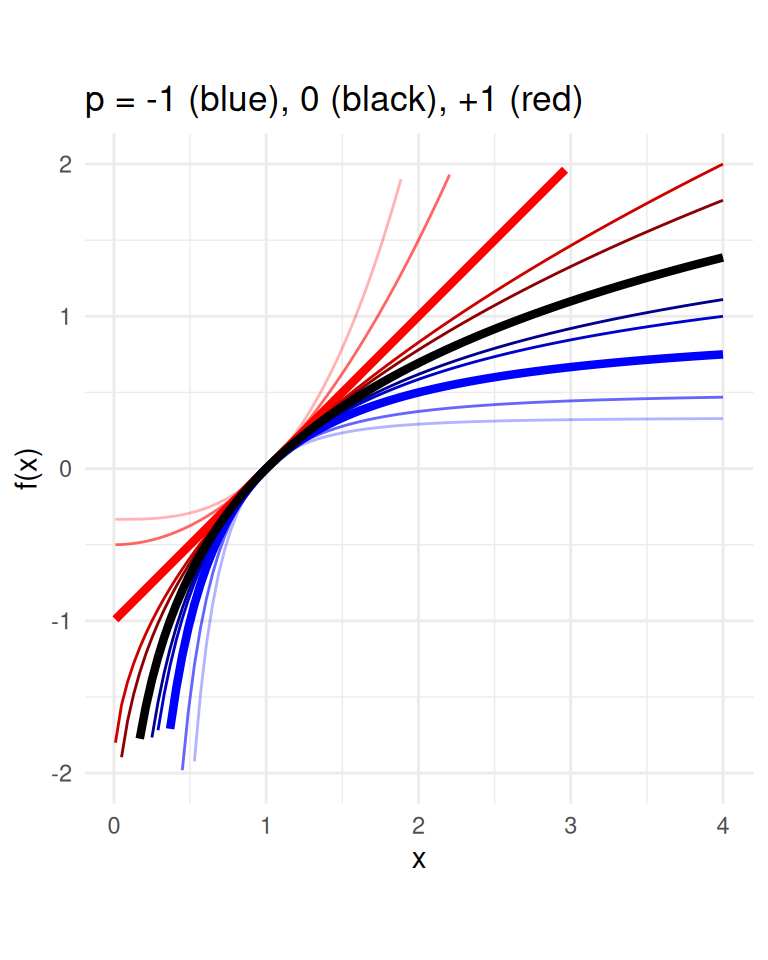
Application: The Wisdom of the Crowd
- Phenomenon: When collective estimate of a diverse group of independent individuals is better than that of single experts.
- The classical wisdom-of-the-crowds finding is about point estimation of a continuous quantity.
- Popularized by James Surowiecki (2004).
- The opening anecdote is about Francis Galton’s1 surprise in 1907 that the crowd at a county fair accurately guessed the weight of an ox’s meat when their individual guesses were averaged.


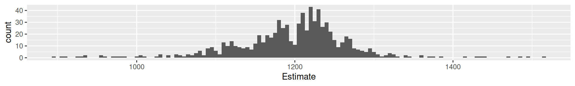
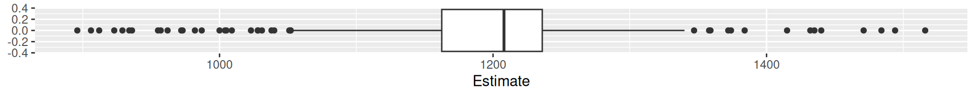
Galton’s data1
What is the weight of the meat of this ox?
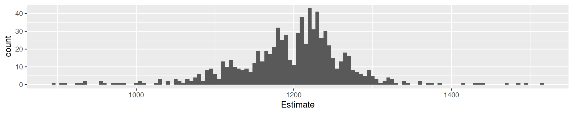
galton |> ggplot(aes(Estimate)) + geom_histogram(binwidth = 5) +
 geom_vline(xintercept = 1198, color = "green") +
 geom_vline(xintercept = mean(galton$Estimate), color = "red") +
 geom_vline(xintercept = median(galton$Estimate), color = "blue") +
 geom_vline(xintercept = Mode(galton$Estimate), color = "purple")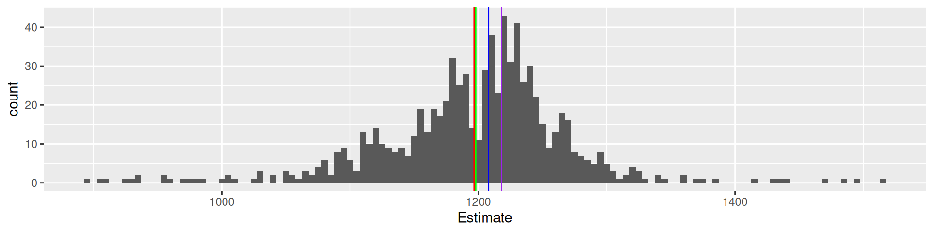
787 estimates, true value 1198, mean 1196.7, median 1208, mode 1218
Viertelfest Bremen 20081
How many lots will be sold by the end of the festival?
viertel |> ggplot(aes(`Schätzung`)) + geom_histogram() +
 geom_vline(xintercept = 10788, color = "green") +
 geom_vline(xintercept = mean(viertel$Schätzung), color = "red") +
 geom_vline(xintercept = median(viertel$Schätzung), color = "blue") +
 geom_vline(xintercept = Mode(viertel$Schätzung), color = "purple")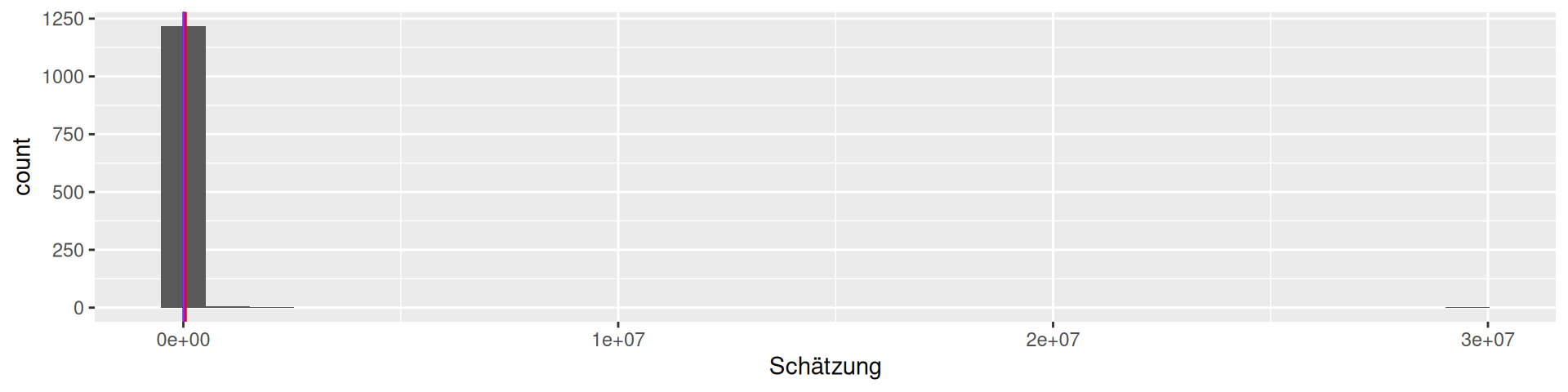
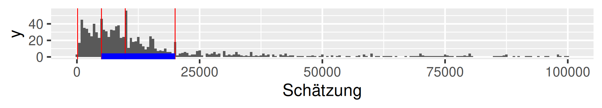
1226 estimates, the maximal value is 29530000! We should filter …
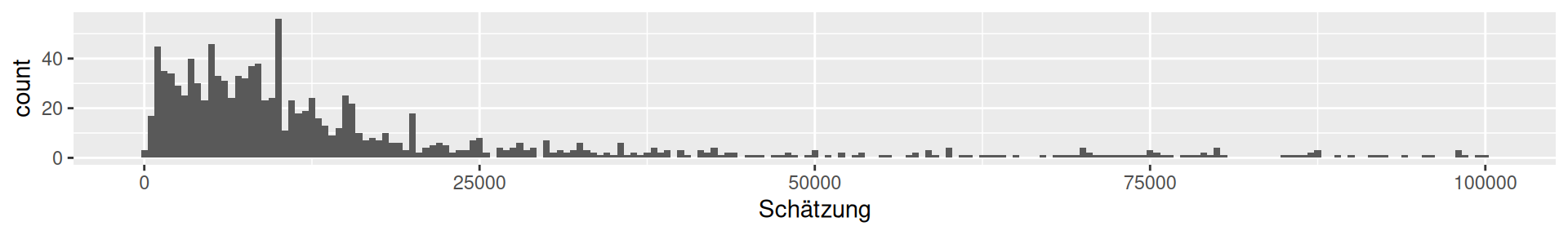
Viertelfest Bremen 2008
How many lots will be sold by the end of the festival?
viertel <- read_csv("data/Viertelfest.csv")
viertel |> filter(Schätzung<100000) |> ggplot(aes(`Schätzung`)) + geom_histogram(binwidth = 500) +
 geom_vline(xintercept = 10788, color = "green") +
 geom_vline(xintercept = mean(viertel$Schätzung), color = "red") +
 geom_vline(xintercept = median(viertel$Schätzung), color = "blue") +
 geom_vline(xintercept = Mode(viertel$Schätzung), color = "purple") +
 geom_vline(xintercept = exp(mean(log(viertel$Schätzung))), color = "orange")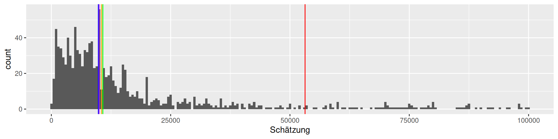
1226 estimates, true value 10788, mean 53163.9, median 9843, mode 10000,
geometric mean 10510.1
\(\log_{10}\) transformation Viertelfest
viertel |> mutate(log10Est = log10(Schätzung)) |> ggplot(aes(log10Est)) + geom_histogram(binwidth = 0.05) +
 geom_vline(xintercept = log10(10788), color = "green") +
 geom_vline(xintercept = log10(mean(viertel$Schätzung)), color = "red") +
 geom_vline(xintercept = log10(median(viertel$Schätzung)), color = "blue") +
 geom_vline(xintercept = log10(Mode(viertel$Schätzung)), color = "purple") +
 geom_vline(xintercept = mean(log10(viertel$Schätzung)), color = "orange")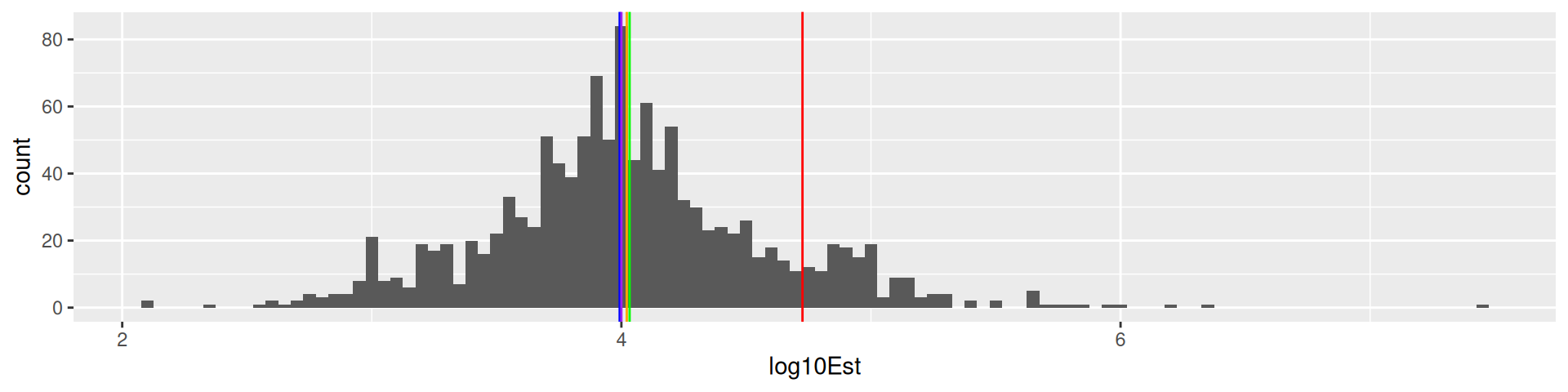
1226 estimates, true value 10788, mean 53163.9, median 9843, mode 10000,
geometric mean 10510.1
Data Sets 1a and 1b: Widsom of Crowd
1a: Ox weigh guessing competition 1907 (collected by Galton)
1b: Viertelfest “guess the number of sold lots”-competition 2009
Data Set 2: Palmer Penguins
Chinstrap, Gentoo, and Adélie Penguins


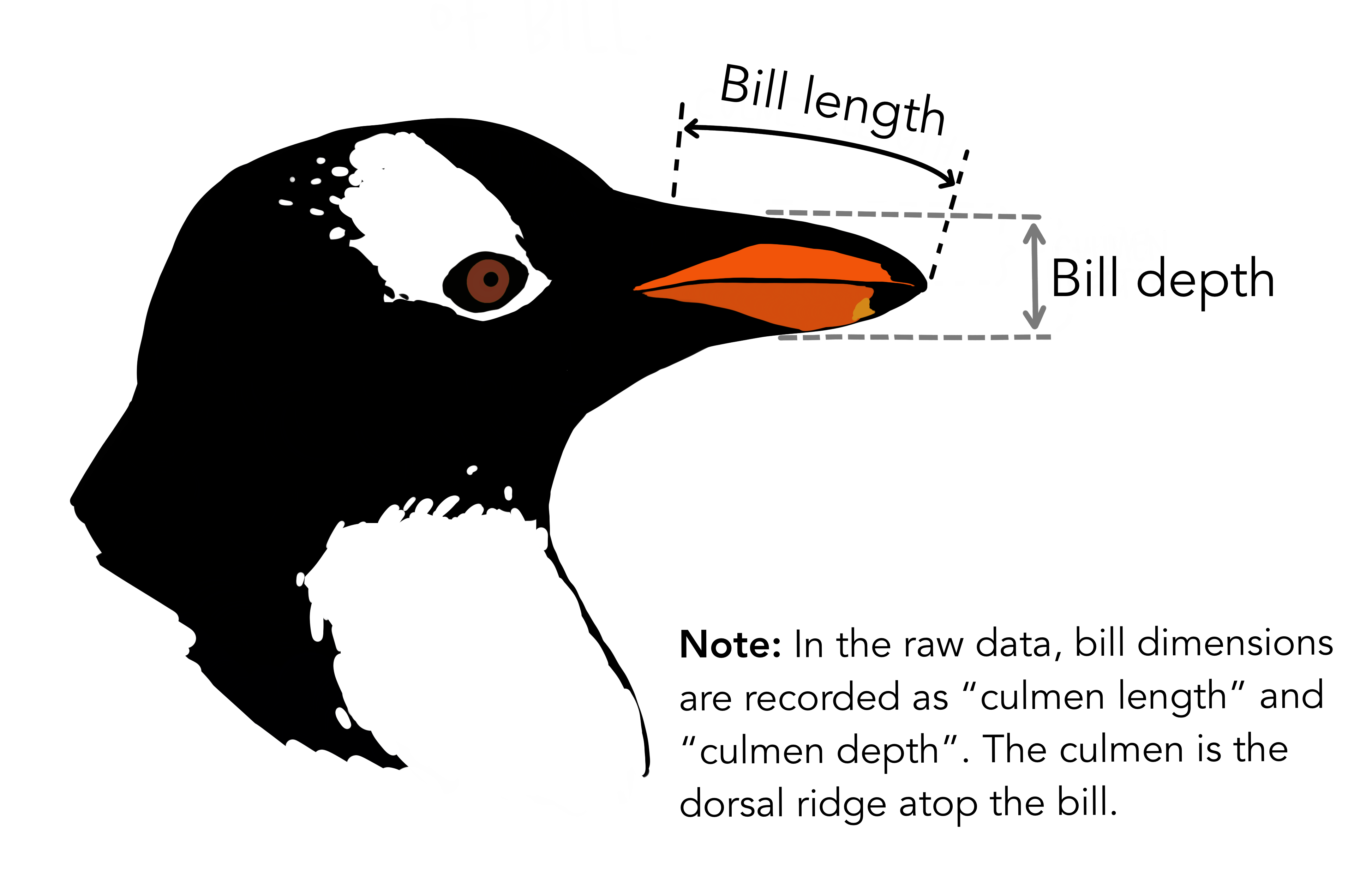
# A tibble: 344 × 8
   species island    bill_length_mm bill_depth_mm flipper_length_mm body_mass_g
   <fct>   <fct>              <dbl>         <dbl>             <int>       <int>
 1 Adelie  Torgersen           39.1          18.7               181        3750
 2 Adelie  Torgersen           39.5          17.4               186        3800
 3 Adelie  Torgersen           40.3          18                 195        3250
 4 Adelie  Torgersen           NA            NA                  NA          NA
 5 Adelie  Torgersen           36.7          19.3               193        3450
 6 Adelie  Torgersen           39.3          20.6               190        3650
 7 Adelie  Torgersen           38.9          17.8               181        3625
 8 Adelie  Torgersen           39.2          19.6               195        4675
 9 Adelie  Torgersen           34.1          18.1               193        3475
10 Adelie  Torgersen           42            20.2               190        4250
# ℹ 334 more rows
# ℹ 2 more variables: sex <fct>, year <int>1a Galton: Quartiles
    0%    25%    50%    75%   100%
 896.0 1162.5 1208.0 1236.0 1516.0
Interpretation: What does the value at 25% mean?
The 25% of all values are lower than the value. 75% are larger.

1a Galton: 20-quantiles
    0%     5%    10%    15%    20%    25%    30%    35%    40%    45%    50%
 896.0 1078.3 1109.0 1126.9 1150.0 1162.5 1174.0 1181.0 1189.0 1199.0 1208.0
   55%    60%    65%    70%    75%    80%    85%    90%    95%   100%
1214.0 1219.0 1225.0 1231.0 1236.0 1243.8 1255.1 1270.0 1293.0 1516.0 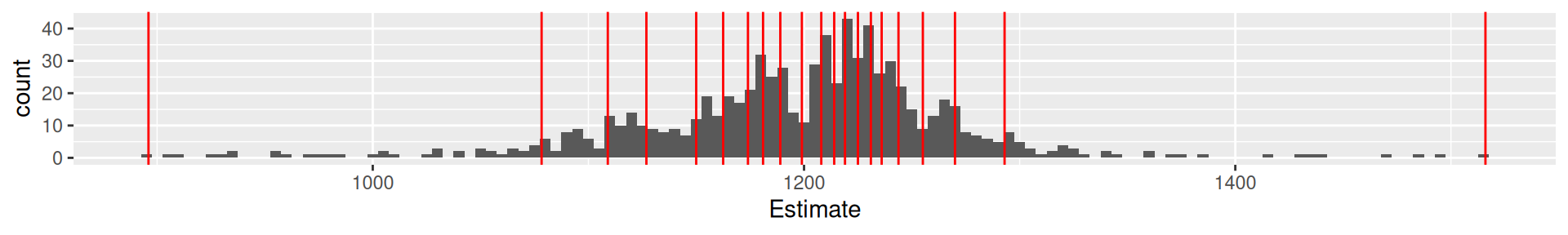
1b Viertelfest: Quartiles
      0%      25%      50%      75%     100%
120 5000 9843 20000 29530000 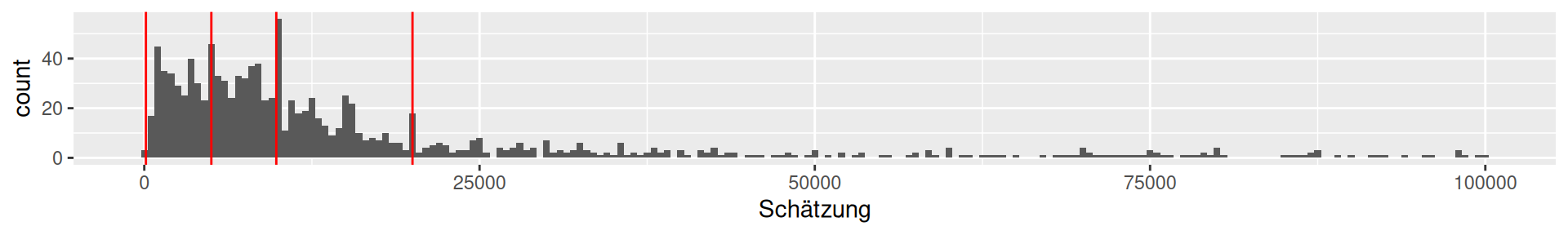
1b Viertelfest: 20-quantiles
         0%          5%         10%         15%         20%         25%
     120.00     1213.25     2000.00     3115.00     4012.00     5000.00
        30%         35%         40%         45%         50%         55%
    5853.50     7000.00     7821.00     8705.25     9843.00    10967.50
        60%         65%         70%         75%         80%         85%
   12374.00    14444.00    16186.00    20000.00    27500.00    38000.00
        90%         95%        100%
63649.50 99773.50 29530000.00 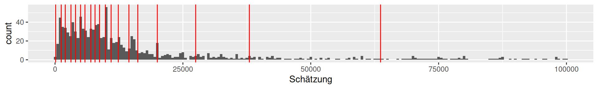
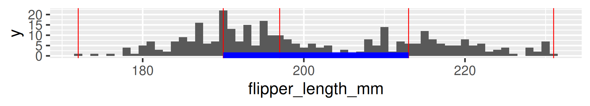
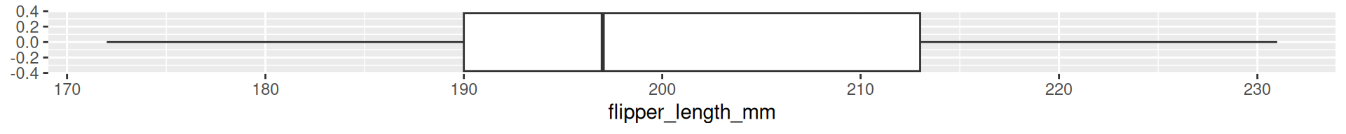
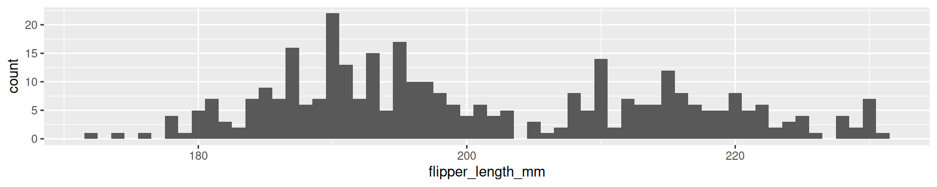
2 Palmer Penguins Flipper Length: Quartiles
  0%  25%  50%  75% 100%
172 190 197 213 231 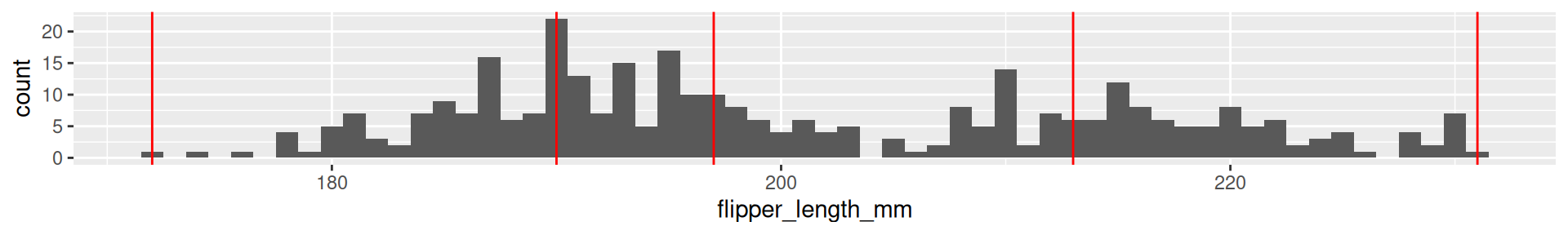
2 Palmer Penguins Flipper Length: 20-quantiles
   0%    5%   10%   15%   20%   25%   30%   35%   40%   45%   50%   55%   60%
172.0 181.0 185.0 187.0 188.0 190.0 191.0 193.0 194.0 195.0 197.0 199.0 203.0
  65%   70%   75%   80%   85%   90%   95%  100%
208.0 210.0 213.0 215.0 218.0 220.9 225.0 231.0 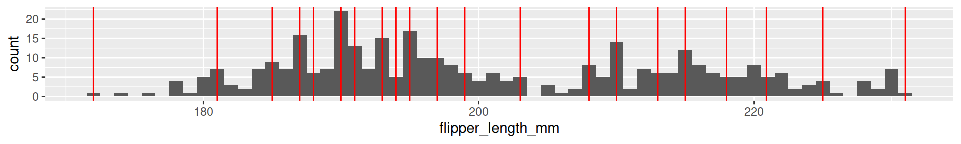
Interquartile range (IQR)
The difference between the 1st and the 3rd quartile. Alternative dispersion measure.
The range in which the middle 50% of the values are located.
Examples:
[1] 73.5[1] 73.58677[1] 15000[1] 848395.5[1] 23[1] 14.06171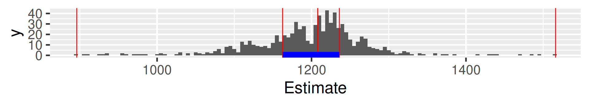
Boxplots
A condensed visualization of a distribution showing location, spread, skewness and outliers.

- The box shows the median in the middle and the other two quartiles as their borders.
- Whiskers: From above the upper quartile, a distance of 1.5 times the IQR is measured out and a whisker is drawn up to the largest observed data point from the dataset that falls within this distance. Similarly, for the lower quartile.
- Whiskers must end at an observed data point! (So lengths can differ.)
- All other values outside of box and whiskers are shown as points and often called outliers. (There may be none.)
Boxplots vs. histograms
- Histograms can show the shape of the distribution well, but not the summary statistics like the median.
Boxplots vs. histograms
- Boxplots can not show the patterns of bimodal or multimodal distributions.
Skewness
The skewness of a distribution is a measure of its asymmetry.
Equation: \(\text{skewness} = \frac{\frac{1}{n}\sum_{i=1}^n(x_i - \mu)^3}{\left(\frac{1}{n}\sum_{i=1}^n(x_i - \mu)^2\right)^{3/2}}\)
- Positive skewness: The right tail is longer or fatter than the left tail.
- Negative skewness: The left tail is longer or fatter than the right tail.

The relation of mean and median can give a hint on skewness!
The Viertelfest data is heavily positively skew. (The Galton data is a little bit negatively skew, but it is barely visible.)
Kurtosis
The kurtosis of a distribution is a measure of the “tailedness” of the distribution. It often goes along with also higher “peakedness”.
Equation: \(\text{kurtosis} = \frac{\frac{1}{n}\sum_{i=1}^n(x_i - \mu)^4}{\left(\frac{1}{n}\sum_{i=1}^n(x_i - \mu)^2\right)^{2}}\)
- Leptokurtic: Fatter tails and a higher peak than the normal distribution.
- Platykurtic: Thinner tails and a lower peak than the normal distribution.

 A logarithmic y-axis shows the fatter tails!
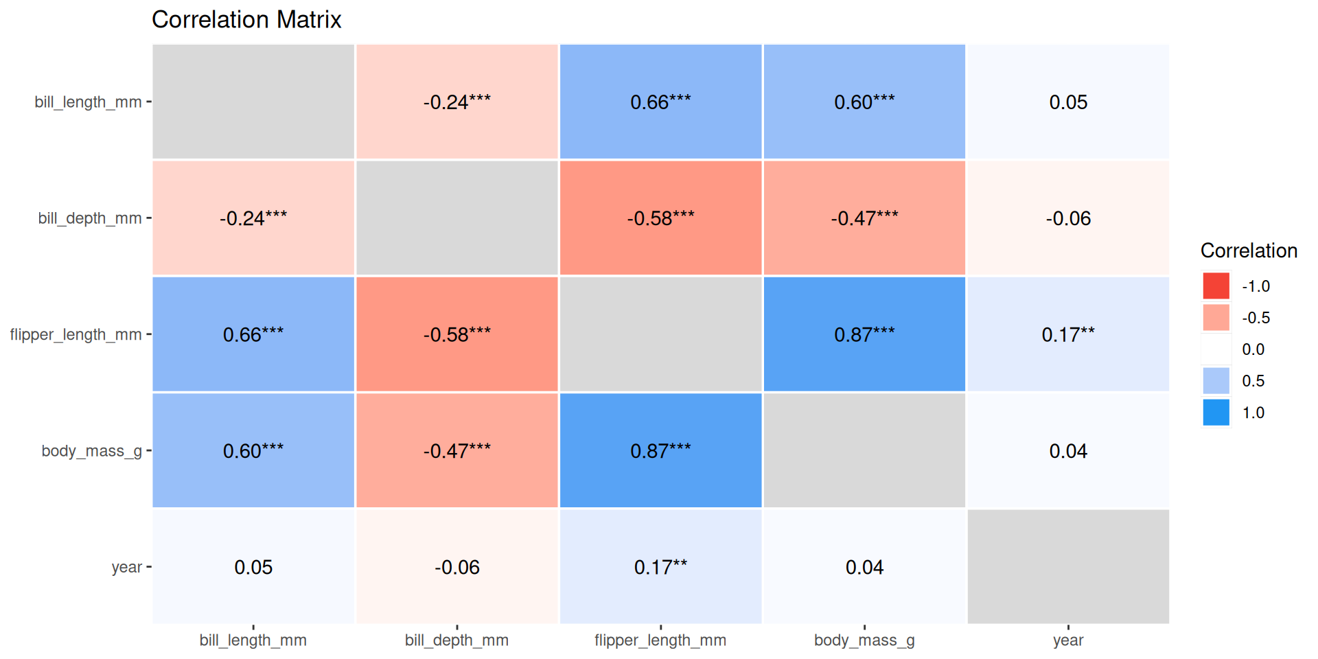
Correlation visualization
Exploratory Data Analysis
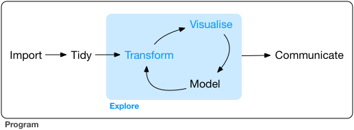
EDA is the systematic exploration of data using
- visualization
- transformation
- computation of characteristic values
- modeling
Descriptive Projects
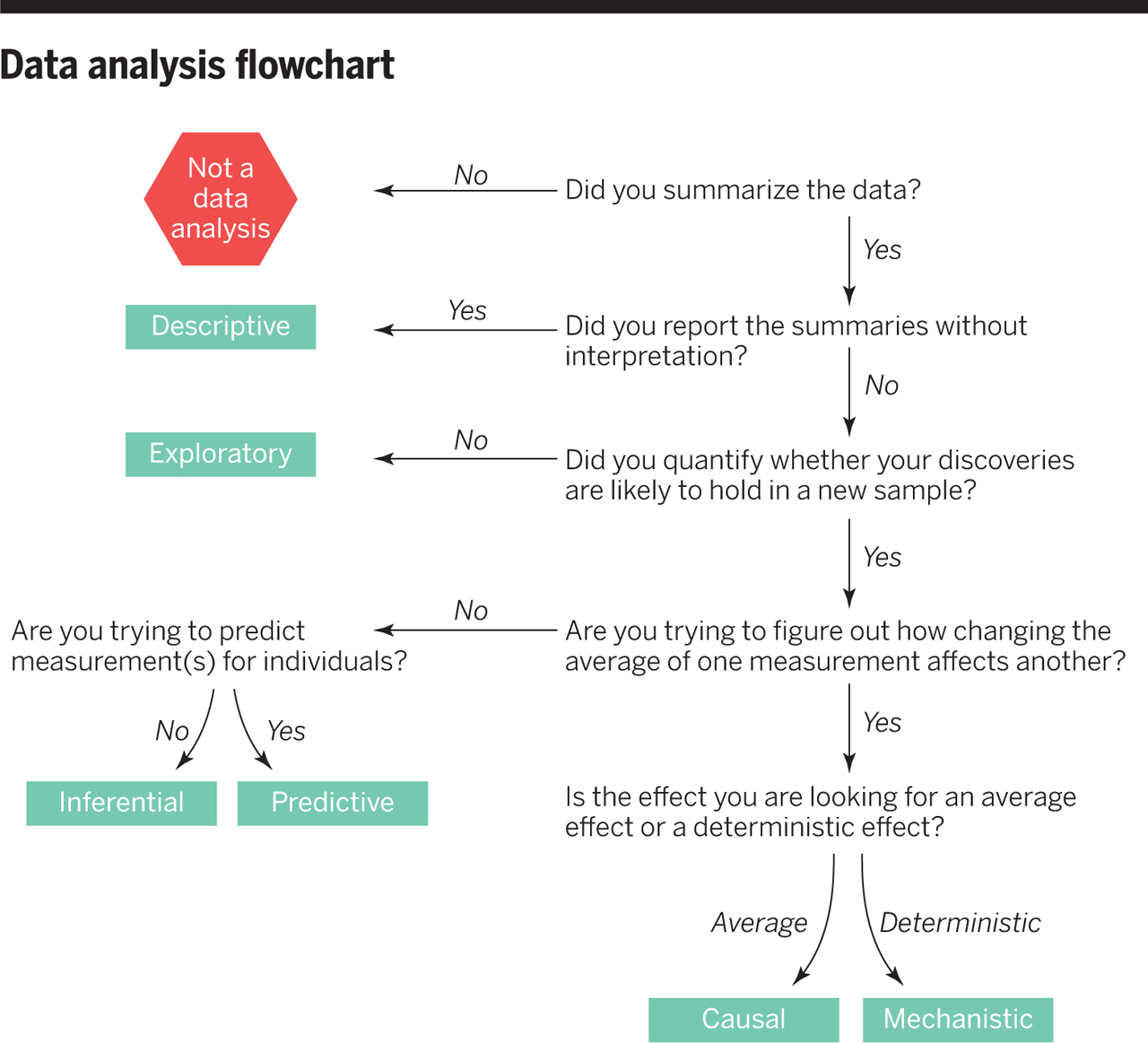
Data Analysis Flowchart
Context Information is important!
- Not all information is in the data!
- Potential confounding variables you infer from general knowledge
- Information about data collection you may receive from an accompanying report
- Information about computed variables you may need to look up in accompanying documentation
- Information about certain variables you may find in an accompanying codebook. For example the exact wording of questions in survey data.